Jun 10, 2025
How to Bring Apple’s Liquid Glass UI to Your App or Website (Without Rebuilding Everything)

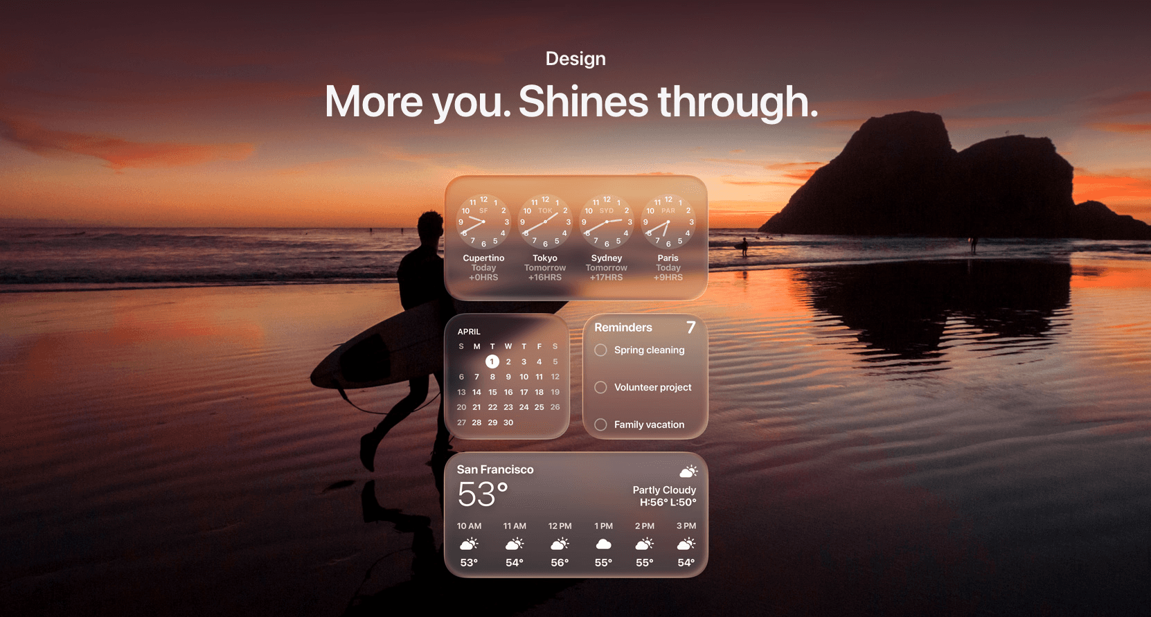
Apple’s new Liquid Glass design language is here and it’s changing what users expect from modern digital products. Translucent panels, layered depth, dynamic light, and fluid motion are the new baseline.
But here’s the good news:
You don’t need to start from scratch to upgrade.
With the right strategy, small teams and growing startups can implement Liquid Glass into their current product without a full rebuild.
At Honter Studio, we’ve already mapped out the process. Let’s walk through it.
If you’re new to the concept of Liquid Glass, here’s what it is and why it matters →
Step 1: Audit Your Current UI for Compatibility
Before designing anything new, we analyze your existing interface to identify:
What components can be adapted (cards, nav bars, modals)
Where depth or translucency can be introduced without breaking UX
What should remain intentionally simple to avoid visual overload
Pro tip: Liquid Glass is not just an aesthetic, it's about focus and flow. We’ll flag anything that disrupts that.
Step 2: Define the “Glass Zones”
We work with you to decide where Liquid Glass makes sense:
Header bars
Tab bars
Widget containers
Side panels or floating cards
Background layers behind modals or menus
These become your “glass zones”, places that support the new visual language without sacrificing clarity.
Step 3: Design Custom Components (That Feel Native)
We don’t just slap Apple’s look on your app.
Instead, we redesign:
UI kits with your brand colors and your product tone
Components that feel modern but unique not generic Apple clones
Light/dark mode transitions and animations that feel alive
This preserves your brand identity while embracing the new era.
Step 4: Dev Handoff & Integration Support
We build all assets and documentation to make your dev team’s life easier:
Figma specs + component variants
Blur, transparency, and animation values
Environment-specific considerations (iOS, macOS, visionOS, web)
And if you don’t have a dev team? We’ll help connect you with one or coordinate directly.
Step 5: Test for Feel, Not Just Function
Liquid Glass is about emotional experience, not just visual structure.
That’s why we test for:
Speed of interaction (blur shouldn’t lag)
Focus clarity (is the foreground always clear?)
Delight moments (do animations guide the user intuitively?)
We validate that the update actually feels better not just looks different.
Want to see how startups are using Liquid Glass to stand out? Check our startup-focused guide here →
What This Looks Like in Real Life
Case | Approach |
|---|---|
MVP update | Add glass zones + animations without touching backend logic |
Investor demo | Mock up a Liquid Glass prototype to wow with visuals |
Product relaunch | Refresh your UI with a Liquid Glass-driven redesign, phased in over sprints |
SaaS dashboard | Use translucent containers + motion to declutter and simplify complex workflows |
Final Thoughts
Liquid Glass isn’t just a trend, it’s Apple’s direction. And if your product feels modern, users will trust it more.
You don’t need to go full enterprise to get there.
Want to see how Liquid Glass could elevate your product?